
Your Webflow Page
TikTok Shop

Helping shoppers decide, trust, and explore on TikTok Shop

TikTok | Jul 2025 - Present
Project overview
Role
Responsibilities
  • Selected design work across AI-assisted shopping, merchant trust, and storefront experiences — the specific design decisions and the product evidence behind them, with a focus on how the product helps shoppers understand products, recognize merchants, and keep exploring.
  • UX Designer, Consumer
  • User research
  • UX design (mobile app)
  • Usability testing & evaluation
01 AI shopping

How might we help shoppers explore when they don’t yet know what they want?

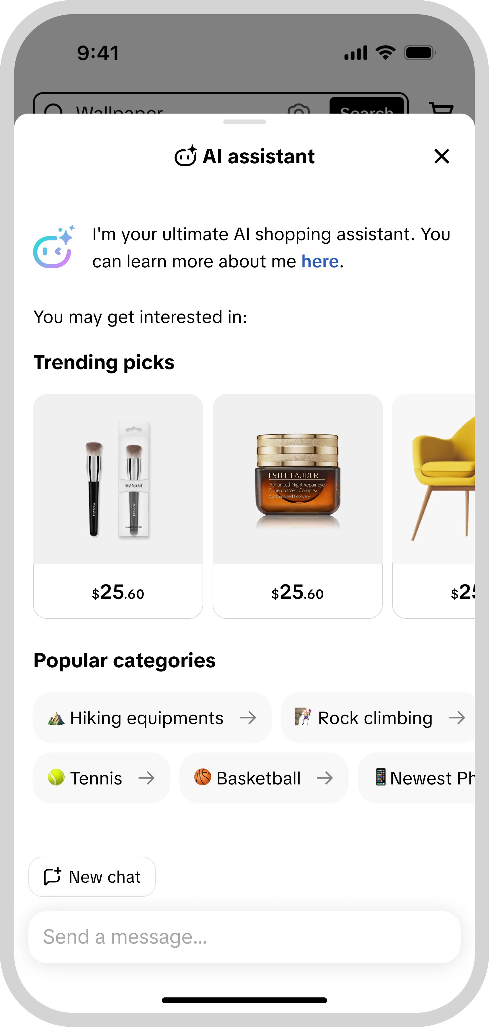
The AI shopping assistant sits alongside the regular shopping flow rather than replacing it. The projects below follow one thread — keep the AI experience consistent across surfaces, make recommendations easier to understand, bring help onto the product page, and support specific tasks like comparison and sizing.

Make AI help recognizable wherever shoppers browse

As AI features spread across the assistant, search, reviews and try-on, the visual language and the labels that say “this is AI” needed to stay consistent. Working from the design inputs of those teams, the shared guidance covers the AI design language, disclosure labels, branding and key-visual usage, and rules for AI-generated images and copy — so a shopper meets the same AI expression whichever surface they are on.
Make recommendations easier to understand

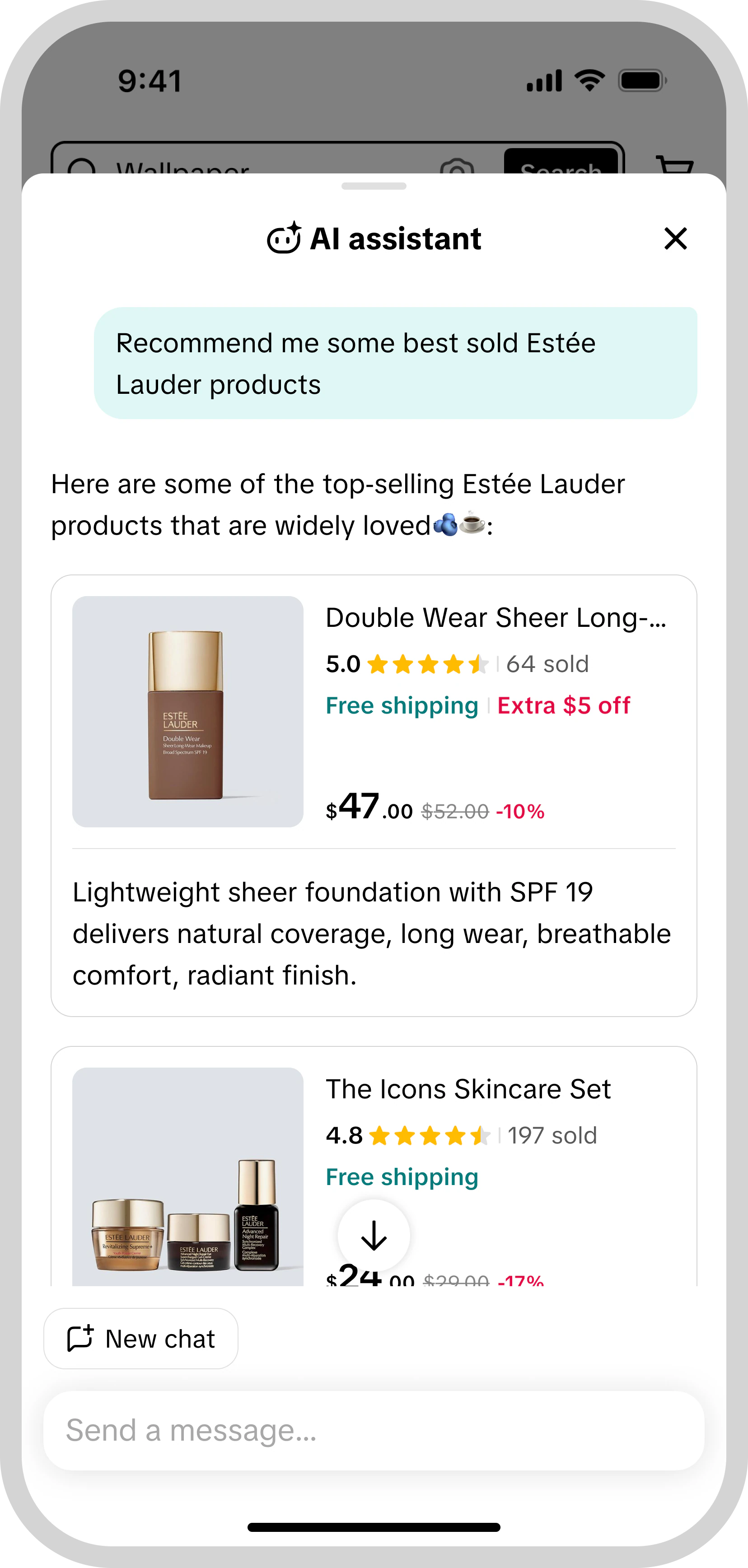
I redesigned the assistant’s product cards to place a one-line recommendation reason alongside the product information. Product and reasoning are read together: a shopper sees what is being suggested and why in the same glance, and can compare neighbouring cards on the same basis before adding one to cart.

Recommendation card experiment — relative changes:

  • Product card CTR +xx% (xx% → xx%)
  • Assistant add-to-cart count +xx%
  • Overall e-commerce GMV per user +xx%

Bring assistance to the product page

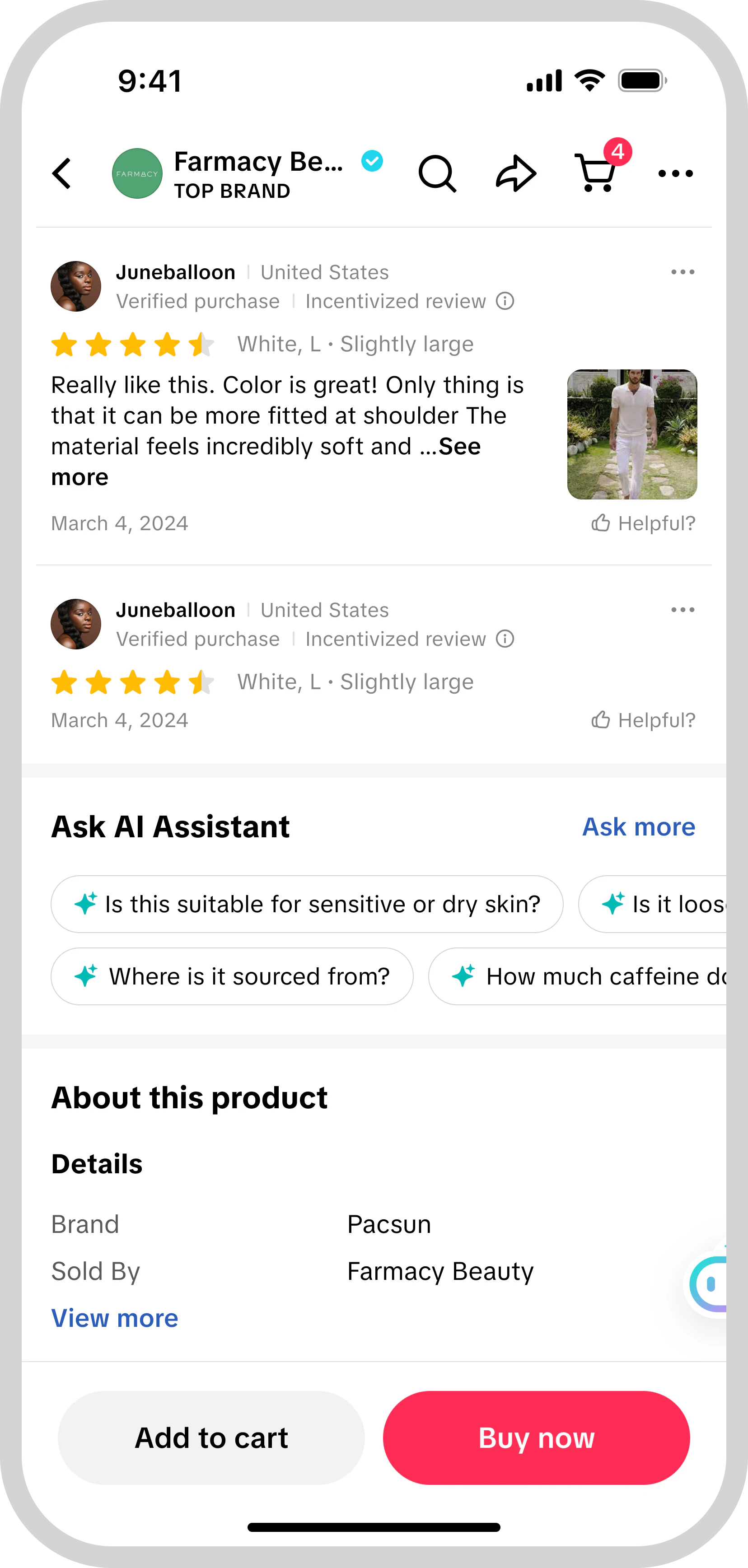
The product detail page gets its own question entry: an “Ask AI Assistant” module with suggested questions about the item in view and a field to type one. Questions are asked where the purchase decision is being made, about the specific product on screen, rather than in a separate assistant the shopper has to go and find. Tap a question, read the answer with its follow-ups, and return to the product.

The suggested questions are framed around the product in view, so the module reads as part of the product information rather than as a generic chat entry.

Product page (PDP) scope — question module experiment:

  • PDP add-to-cart conversion +xx%
  • PDP buy-now conversion +xx%

Within the AI assistant:

  • GMV per user +xx%
  • Messages per user +xx%

How might we help shoppers make confident decisions faster?

Once a shopper has a few candidates in mind, the question shifts from what to look at to which one to buy. This part covers two of those moments — choosing between similar items and choosing a size — where a plain product list leaves the comparing to the shopper, and the assistant can take on more of that work.

Make similar items easier to compare

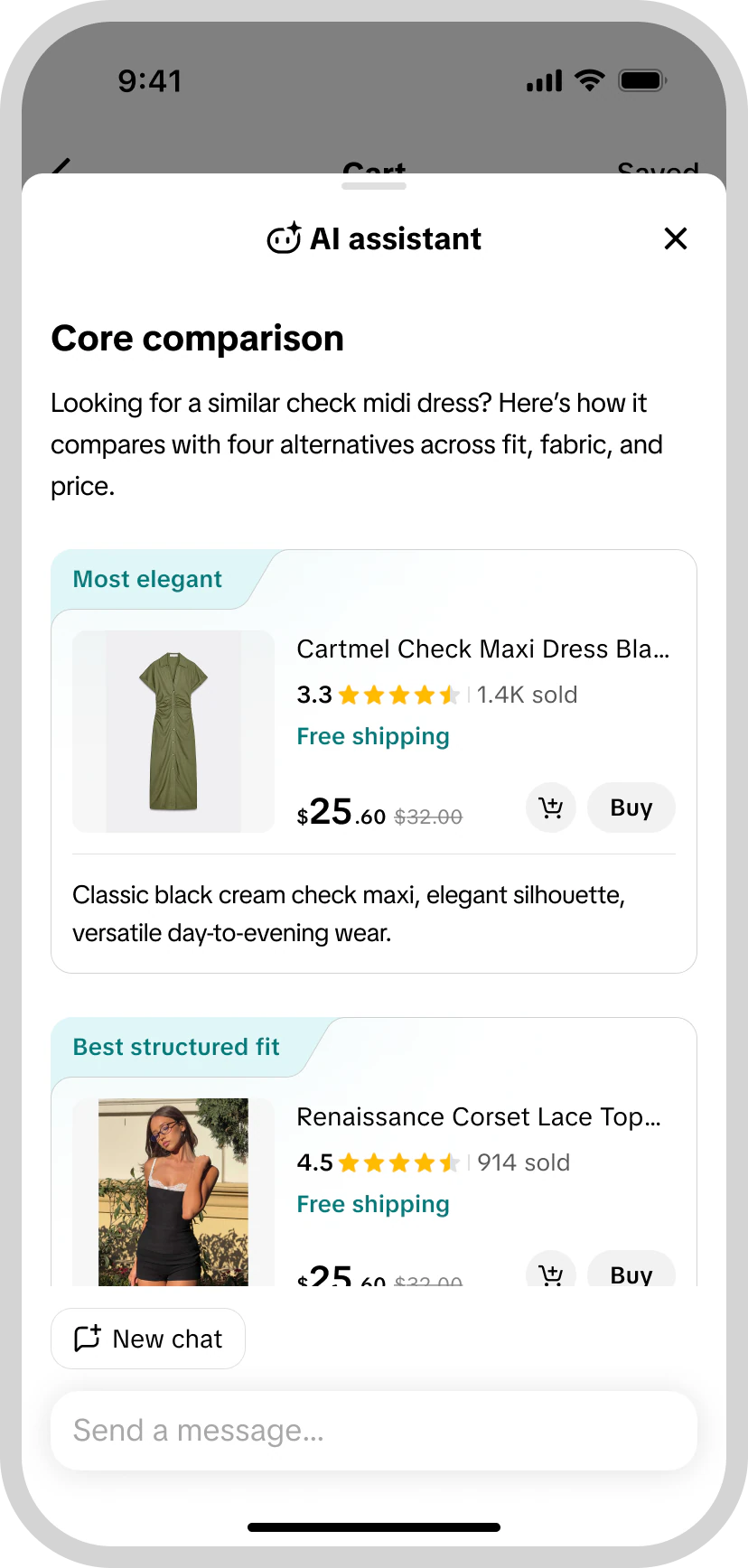
Comparison starts with a short quiz about what matters to the shopper and returns labelled picks such as “Most elegant” or “Best structured fit”, each with a short reason. I designed two comparison formats: cards for reviewing individual recommendations and a table for comparing attributes across products. The format adapts to the category so the differences shown are the ones a shopper would decide on. Comparison entrants showed deeper conversational engagement in the observed data.

Average conversation turns per entry, by entry point (observed data):

  • Compare entry xx
  • PDP entry xx
  • Shop tab entry xx

Help shoppers choose the right size

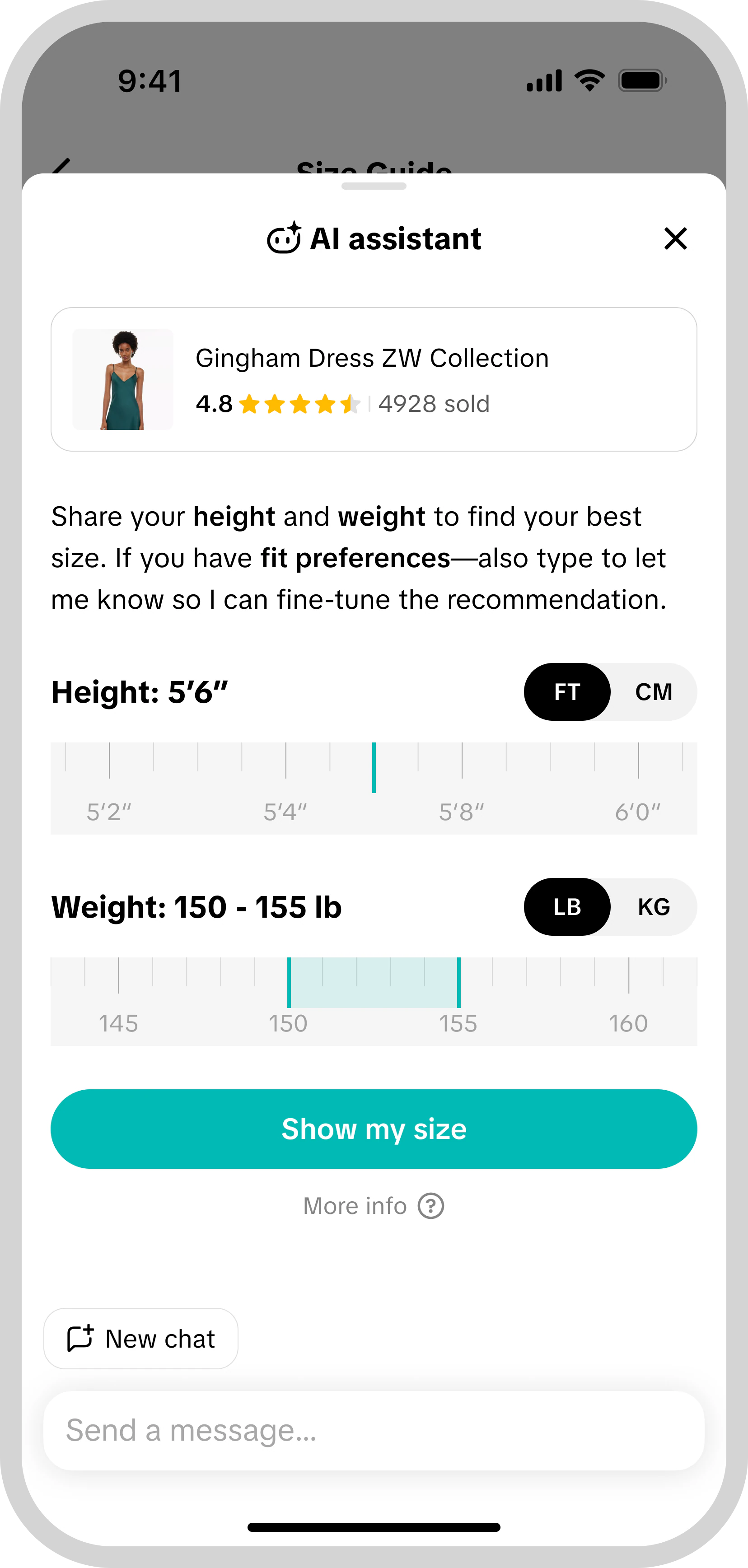
In the conversation, a shopper shares height and weight — and a fit preference if they have one — and gets a recommended size with a profile they can edit and reuse. On the product page, “Find your size” and “My size” entries surface the same recommendation inside the size guide, next to the measurement table.

The in-conversation recommendation was delivered; the product-page entry was tested.

Product-page size entry experiment:

  • GMV per user +xx%
  • Payment penetration +xx%

02 Merchant trust

How might we help shoppers trust who they are buying from?

A shopper meets a merchant many times — in a video, a search result, a live stream, a product page — and again after a purchase. This chapter covers how merchants are identified across those moments and how shoppers are brought back to them.

Make official brand stores recognizable

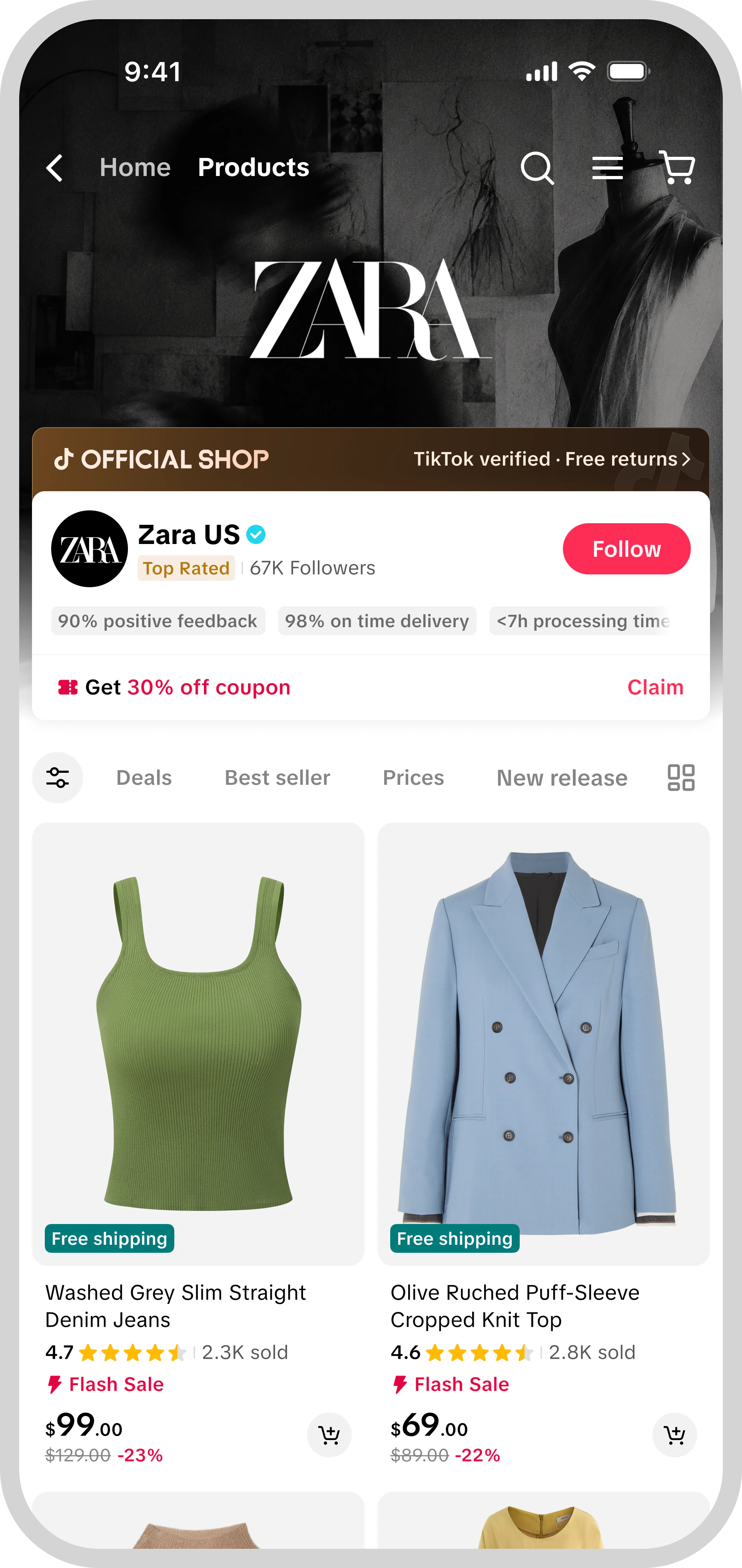
Many major brands sell on TikTok Shop through their own official stores, but nothing in the shopping experience said so. A brand’s own store looked like any other seller, so shoppers had no way to tell a brand-operated store from an uncertified seller or a counterfeit.

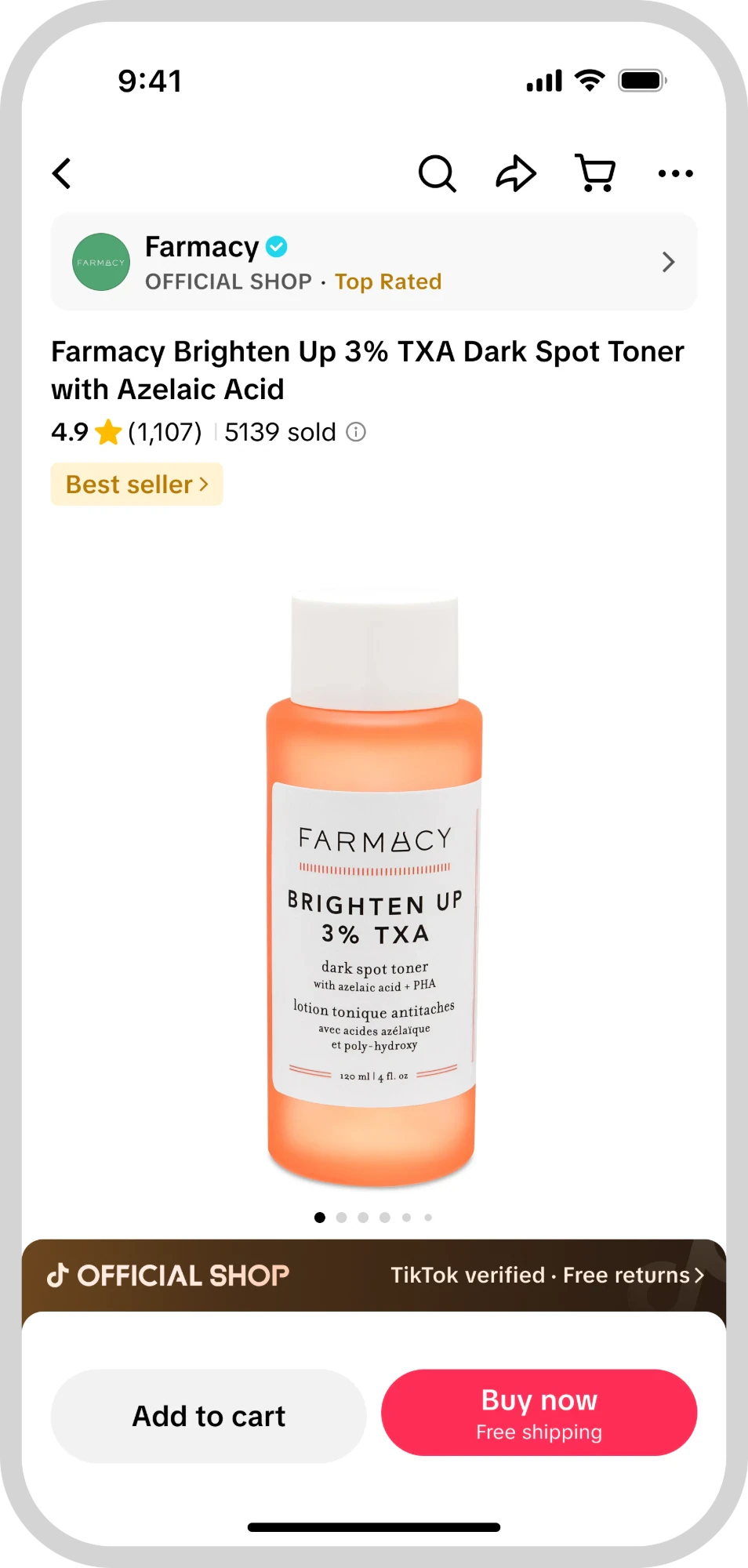
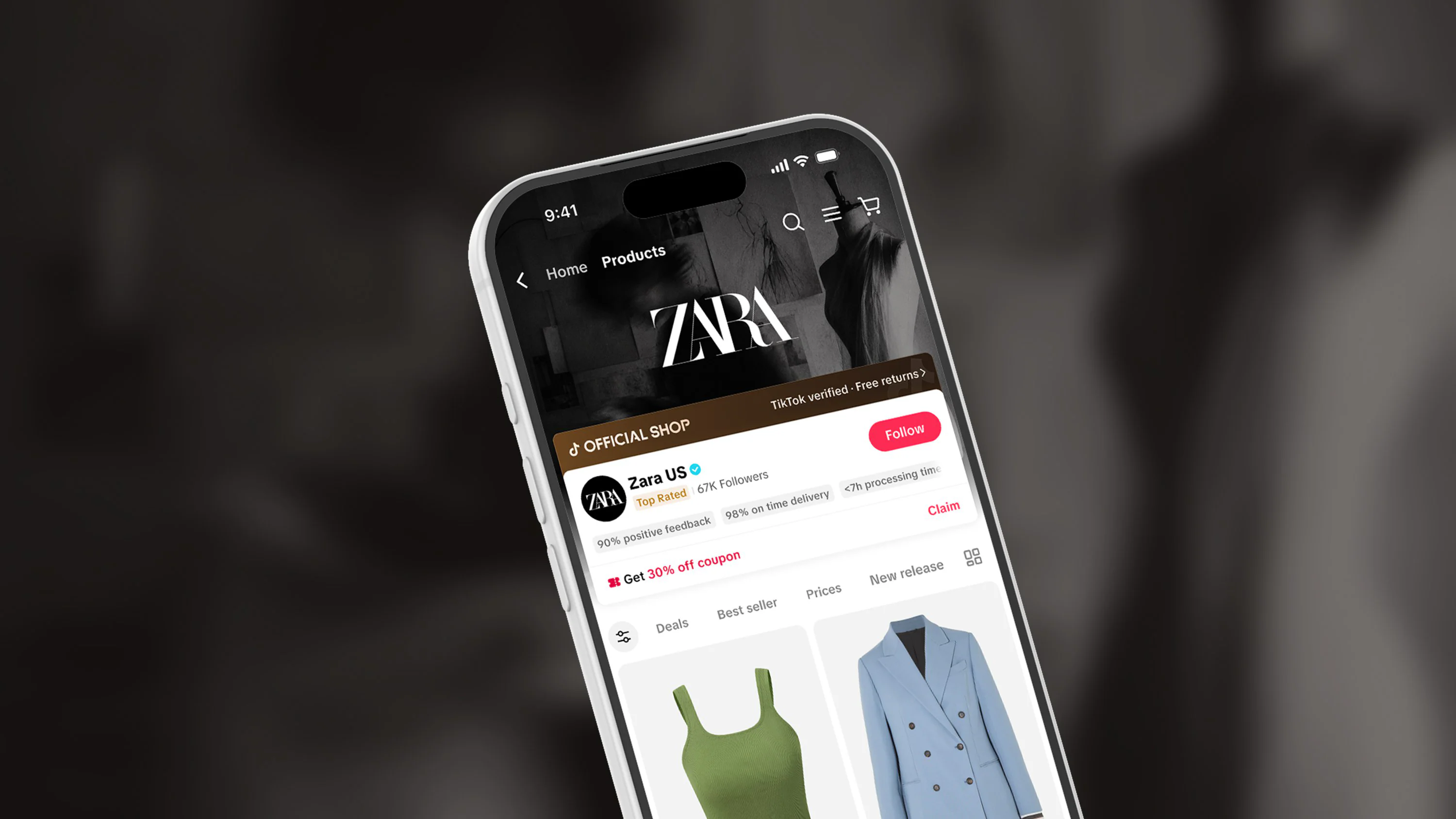
Official Shop gives these stores a clear, consistent identity wherever shoppers meet them — a top bar on the product page, a badge on product cards in the Shop tab, feed, search and LIVE, and a header treatment in the store — adapted for information density and dark backgrounds, with a page explaining what the label guarantees. I also contributed to the earlier exploration of brand awareness that this work grew out of.

Official Shop experiments, each measured in its own scope:

  • Product page — Official Shop top bar: payment penetration +xx%

  • Official merchants (merchant cohort): GMV per user +xx%

Show when a retailer is authorized by the brand

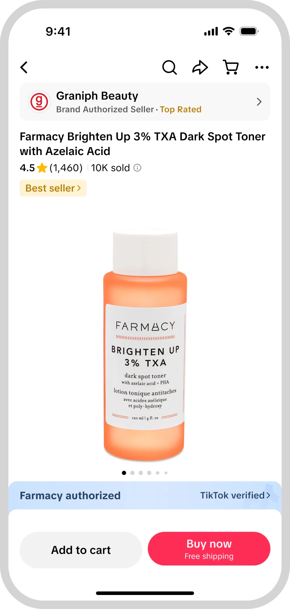
Not every trustworthy seller is the brand itself. Many retailers sell a brand’s products with the brand’s authorization without being its official store. For these merchants, an Authorized label names the brand that authorized them — on the product page it appears as a blue banner, distinct from the Official Shop treatment — so shoppers can tell an authorized retailer apart from both the brand’s own store and an unverified seller.

Authorized merchants (merchant cohort):

  • GMV per user +xx%
  • AOV +xx%

Extend the relationship beyond the visit

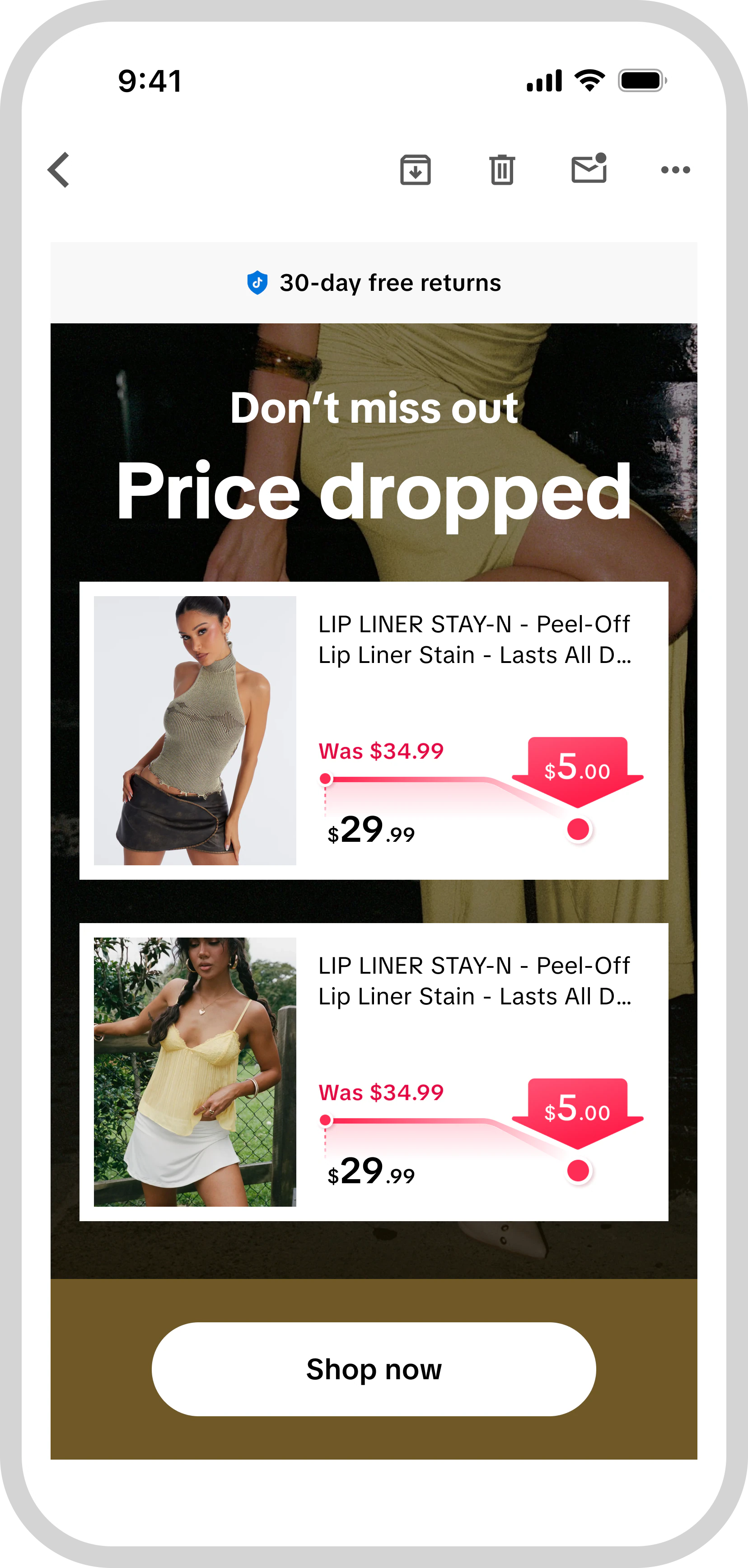
Thirteen CRM email templates were redesigned or added, with a clearer visual hierarchy and product-led content; four had gone live at the time.

CRM-scope experiments:

  • Post-open click UV rate +xx%
  • CRM GMV per user +xx%

A separate exploration looked at how a brand’s membership and benefits could connect to its TikTok store — membership status and rewards shown in the storefront and at checkout. It was concept work with prospective merchants.

03 Store experience

How might we make a store worth exploring?

This chapter covers the store itself: where store-browsing entries land, and what the storefront offers once a shopper is there.

Match the landing experience to store intent

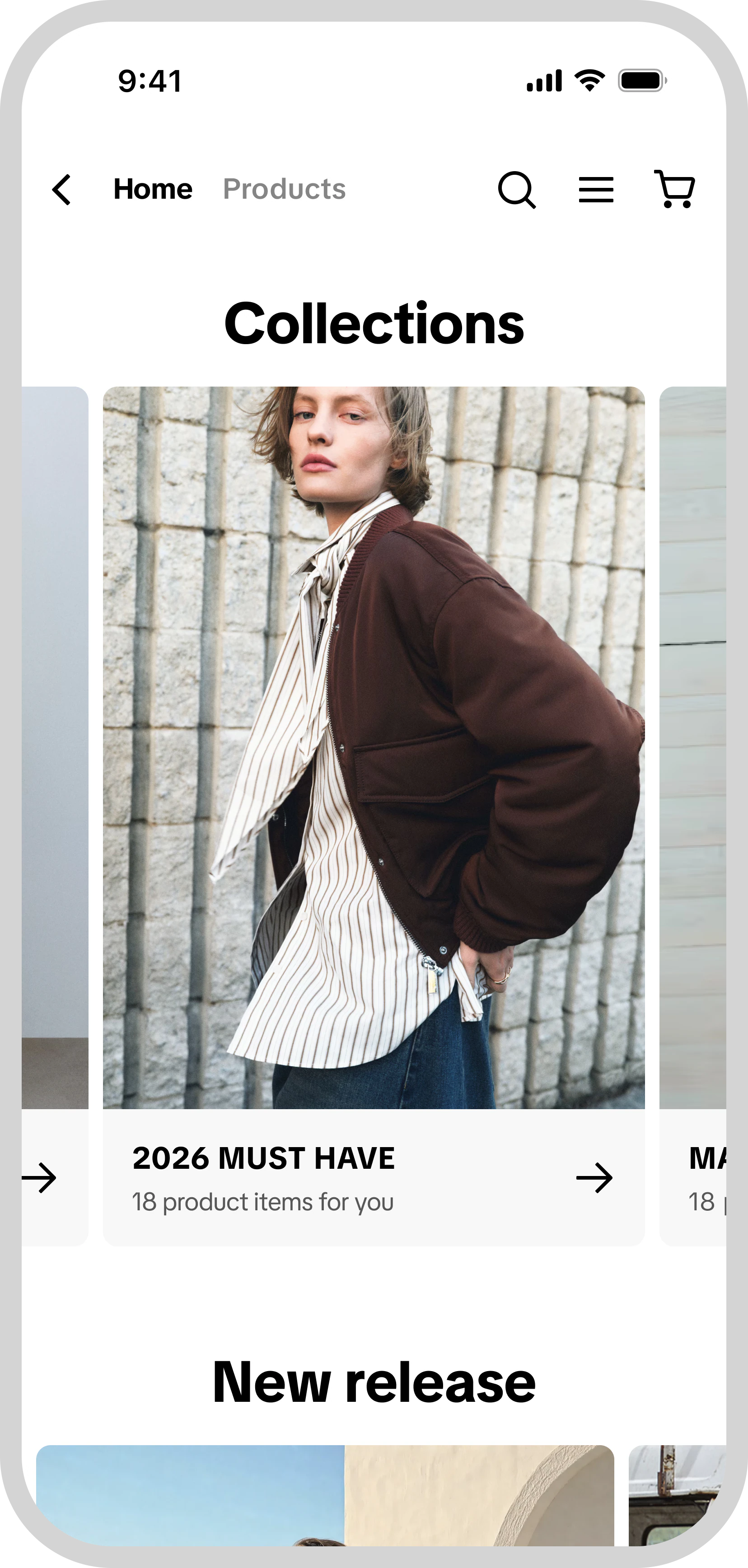
For store-browsing contexts, including profile and following entry points, I worked on shifting the landing experience toward the merchant’s decorated storefront. I also redesigned storefront modules—including featured products, recommendations, and ‘Keep Shopping For’—to make their interactive elements more apparent.

Store landing experiment — change in GMV contribution within the store (approximate):

  • Storefront modules +$xxK

Build a richer storefront

I explored updates to shop headers, coupon areas, video and brand content, in-store search, category navigation, and brand stories. I refined text-logo sizing based on visual weight to create a more consistent appearance across stores. Personalized and AI-assisted decoration were explored separately.

TikTok ShopDesigning shopping experiences across AI assistance, merchant trust, and storefrontsBioMatrixConnecting Web2 and Web3 through AI-powered tokensT-Mobile SkillSphere MREnabling field technicians to gain hands-on experience through active learningMeican OPSPerfecting internal tools for B2B catering managementXCUBERedefining 3D modeling tools for architectural designersMentor RealityBridging innovation gaps between hackers and mentorsAutoMeeticOptimizing hybrid workplace scheduling with an incentive system